Forms are where a website asks you for something: your name, your email, your card. If a form is hard to use, some people can’t finish it at all. And once you press “Send,” it’s fair to ask where your information goes. This note covers both.
The words, in plain English
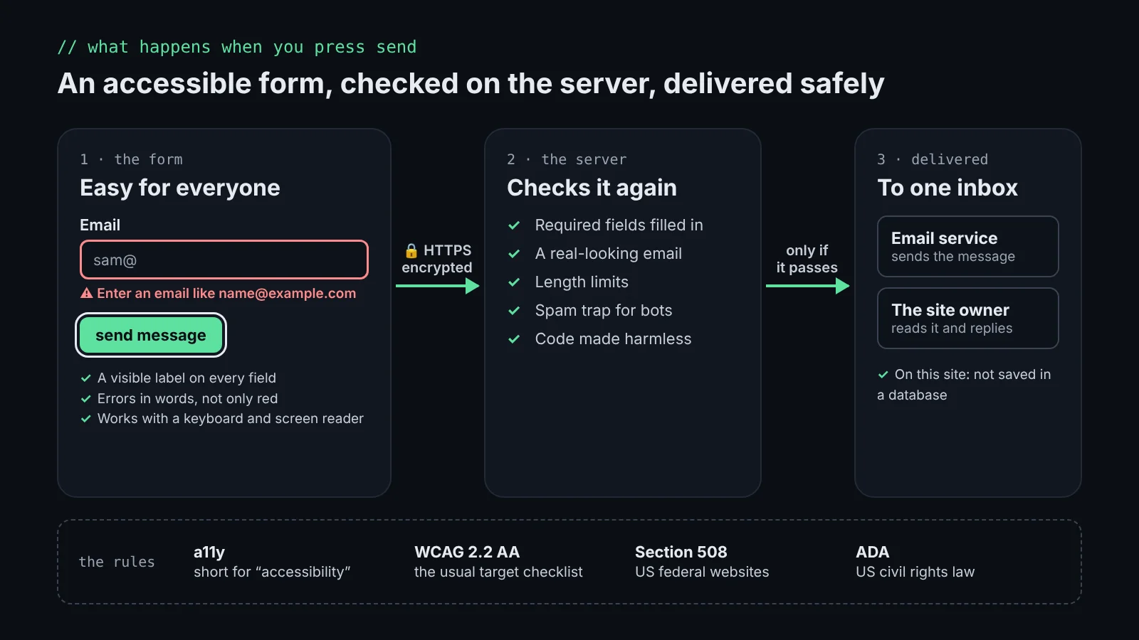
- a11y: short for “accessibility” (an a, 11 letters, then a y). It means people with disabilities can use a site: with a screen reader, a keyboard only, zoomed in, or with low vision or color blindness.
- WCAG: the Web Content Accessibility Guidelines from the W3C, the group that sets web standards. It’s a checklist of testable rules, in three levels: A (basic), AA and AAA (strictest).
- WCAG 2.2 AA: the current version (2.2) at the middle level (AA), the one most organizations aim for. Examples: text has enough contrast, everything works with a keyboard, you can see where the focus is, and buttons are big enough to tap.
- Section 508: a US law that requires federal agencies’ websites and software to be accessible. It uses WCAG 2.0 AA as its standard.
- ADA: the Americans with Disabilities Act, a US civil rights law. Courts have applied it to websites, and a Justice Department rule names WCAG 2.1 AA for state and local government sites.
That’s a summary, not legal advice. For everyday building, the practical target is WCAG 2.2 AA.
What makes a form easy for everyone
A visible label on every field, errors written in words (not just a red border), and an error that’s connected to its field so a screen reader announces it. This is the email field from my contact form, simplified:
<label htmlFor="email">Email</label>
<input
  id="email"
  type="email"
  aria-invalid={hasError}
  aria-describedby={hasError ? "email-error" : undefined}
/>
{hasError && (
  <p id="email-error" role="alert">
    Enter an email like name@example.com
  </p>
)}
htmlFor ties the label to the field, so tapping the word “Email” focuses the box. aria-invalid tells assistive technology the value is wrong. aria-describedby points to the message, and role="alert" reads it out as soon as it appears.
Testing it automatically: cypress-axe
Cypress is a tool that opens a real browser and clicks through a site like a person would. axe is an accessibility checker. cypress-axe joins them, so every test run also checks the page for problems such as missing labels or low contrast, and the build fails if it finds a serious one. I use it in js-in-colors, a free app that teaches JavaScript through colors. Try js-in-colors (opens in a new tab)
cy.visit("/lesson/variables/");
cy.injectAxe();
cy.checkA11y(undefined, { includedImpacts: ["critical", "serious"] });
Automated checks catch many common problems, but not all of them. A person still needs to try the page with a keyboard and a screen reader.
Where your form data goes
Here’s what happens with the contact form on this site. Your message travels encrypted (HTTPS). The server checks it again, because anything sent from a browser can be faked: required fields, a real-looking email, length limits, and a hidden spam-trap field that only bots fill in. It makes any code in the text harmless, then an email service delivers it to my inbox, with your email as the reply address. It isn’t saved in a database on this site. See the contact form
Other sites may do much more with the same form: save it to a database, add you to a mailing list, or send it to a sales system. That’s allowed, but they should tell you in a privacy policy.
Can you assume a form is safe?
Not automatically. A few quick checks help:
- The address starts with https:// and the browser shows no warning.
- You know who runs the site, and it has a privacy policy that says what happens to your data.
- It only asks for what it needs. A contact form doesn’t need your birthday or your card.
- Card details are typed into the payment provider’s secure fields, not a plain text box.
- When in doubt, share less, or contact the company another way.